
Victory Gardens’ previous logo is an orange circle that has already gained some visibility in the theater’s Lincoln Park, Chicago community, and given budget constraints, any new logo would need to be a subtle refresh rather than a full rebrand. The new logo features typography that now fits better within the circle, and brings the emphasis back to the name of the theater, rather than the tagline. The color has now changed to a deeper orange to improve readability.
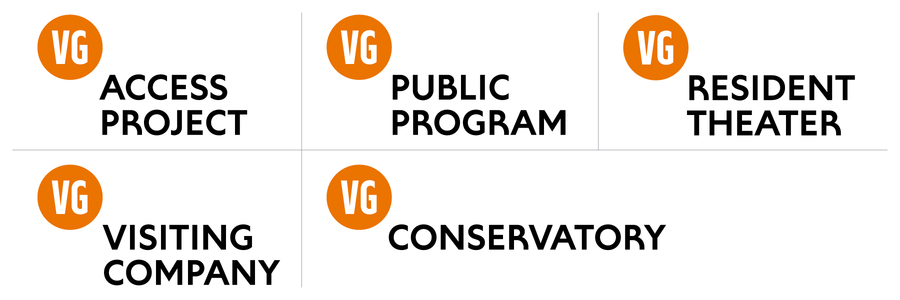
In addition to the full Victory Gardens Theater logo, I created a series of supplemental logos for the theater’s various sub-brands, featuring a simplified circle logo with the letters “VG” (which was already frequently in use as shorthand for Victory Gardens Theater) instead of the full theater name.
Victory Gardens Theater Logo System
Category: Logos & Lettering
Client: Victory Gardens Theater
Victory Gardens is a Tony Award-winning theater in Chicago, dedicated to staging challenging plays and musicals, developing and producing new works, and cultivating an inclusive theater community, housed in the historic landmark Biograph Theater.
The theater has had a challenge in the past connecting with its location in the public’s mind — many in the surrounding Lincoln Park neighborhood know of the Biograph but have not heard of Victory Gardens despite its awards and accolades.
There was no budget for a full rebrand, so I came up with a solution that kept all of Victory Gardens’ most recognizable visual elements while making subtle changes to create a more unique look, tie in with the location, and improve its readability and versatility.
This included slightly deepening the color of the logo for better readability, and creating a custom typeface to replace Gotham in Victory Gardens materials. The new typeface is based loosely on the letterforms of the historic Biograph marquee, though simplifying the shapes to make it easier to read and to give it a more modern feel. The new look also facilitated the creation of new brand assets, such as new window cling signage in front of the theater, and new show poster and print templates.