

Victory Gardens Sans
Category: Typefaces (in progress)
Client: Victory Gardens Theater
Victory Gardens is a Tony Award-winning theater in Chicago, dedicated to staging challenging plays and musicals, developing and producing new works, and cultivating an inclusive theater community, housed in the historic landmark Biograph Theater.
The theater has had a challenge in the past connecting with its location in the public’s mind — many in the surrounding Lincoln Park neighborhood know of the Biograph but have not heard of Victory Gardens despite its awards and accolades.
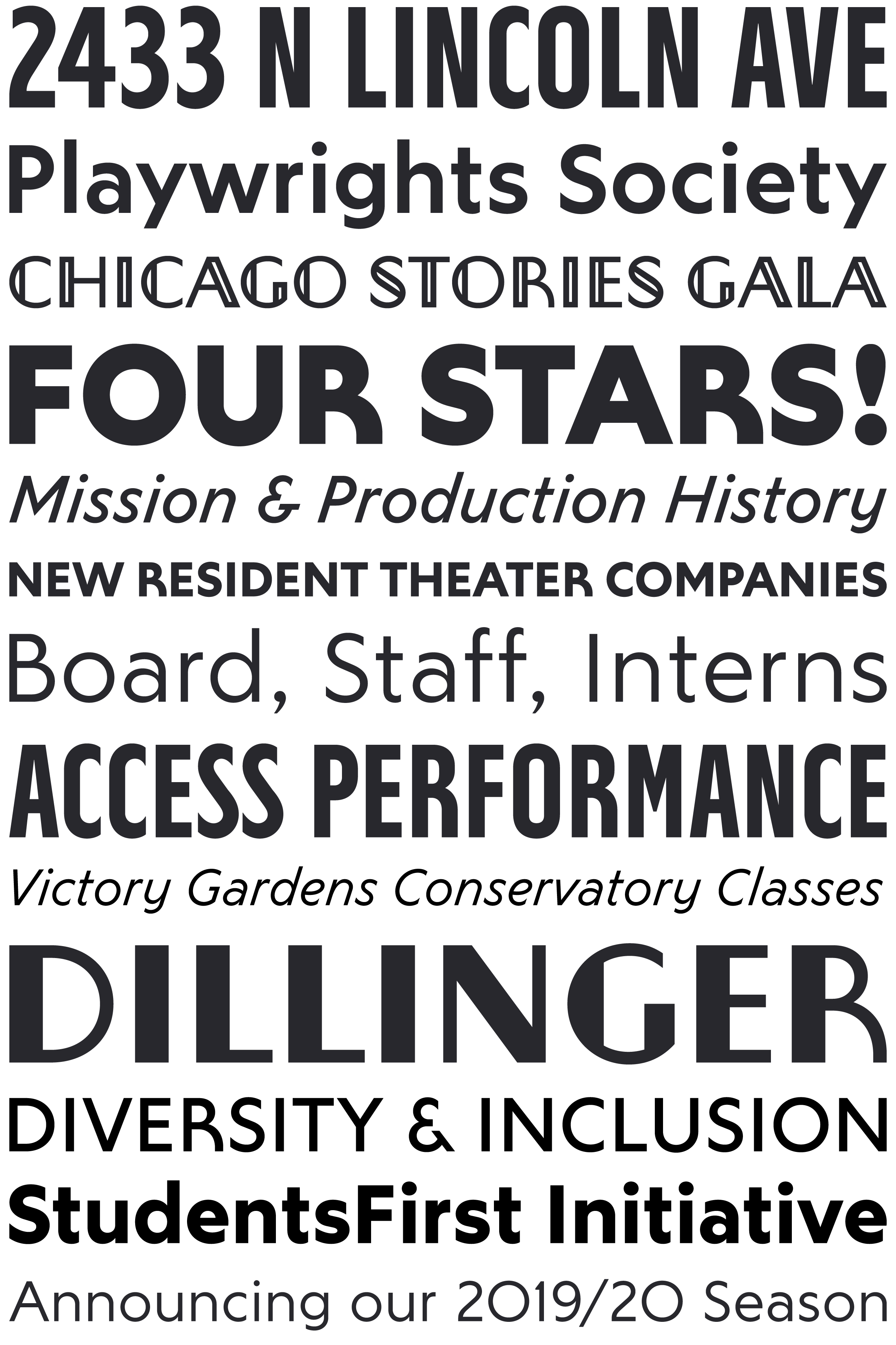
As part of my solution to this issue (which also included an updated logo and exterior building graphics), I created a new typeface called Victory Gardens Sans to replace the ubiquitous Gotham in the theater’s branding and print collateral. The new typeface is based loosely on the letterforms of the historic Biograph marquee, though simplifying the shapes to make it easier to read and to give it a more modern feel to suit the more modern, forward-thinking image of the theater’s work.
The regular Victory Gardens Sans typeface is upper and lowercase in a range of five weights, plus italics. These can be seen in both headline and body text applications. In addition, I have added a few all-caps “titling” companion typefaces; a bold condensed version used in both the Victory Gardens logo and some show title branding alongside the regular Victory Gardens Sans, and a “Deco” version more specifically reminiscent of the theater’s historic marquee (used sparingly in the theater’s branding, specifically for the theater bar and some other items related more to the building and not the theater’s productions).